
Mòr Benwick
Mòr Benwick Whisky Packaging Design

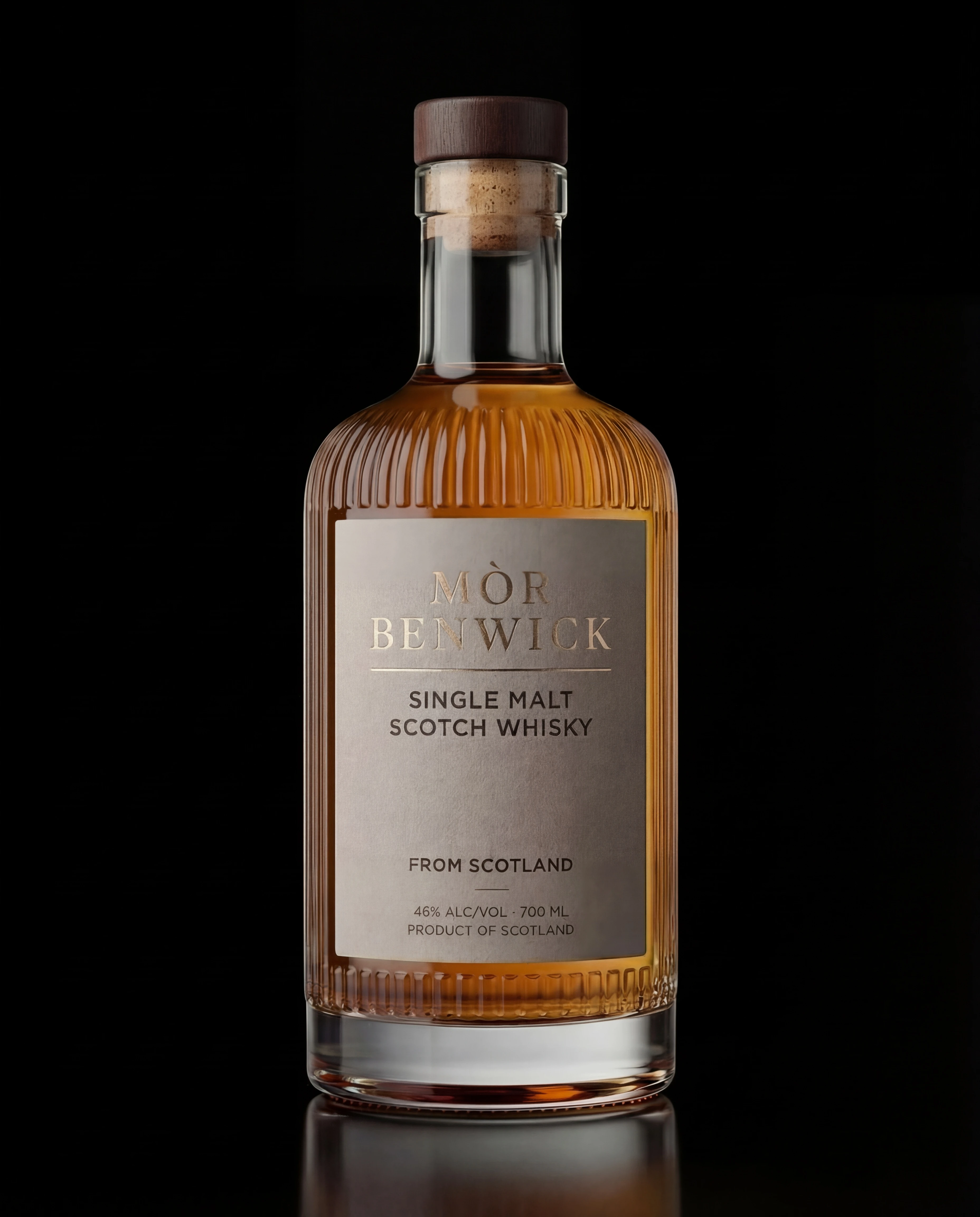
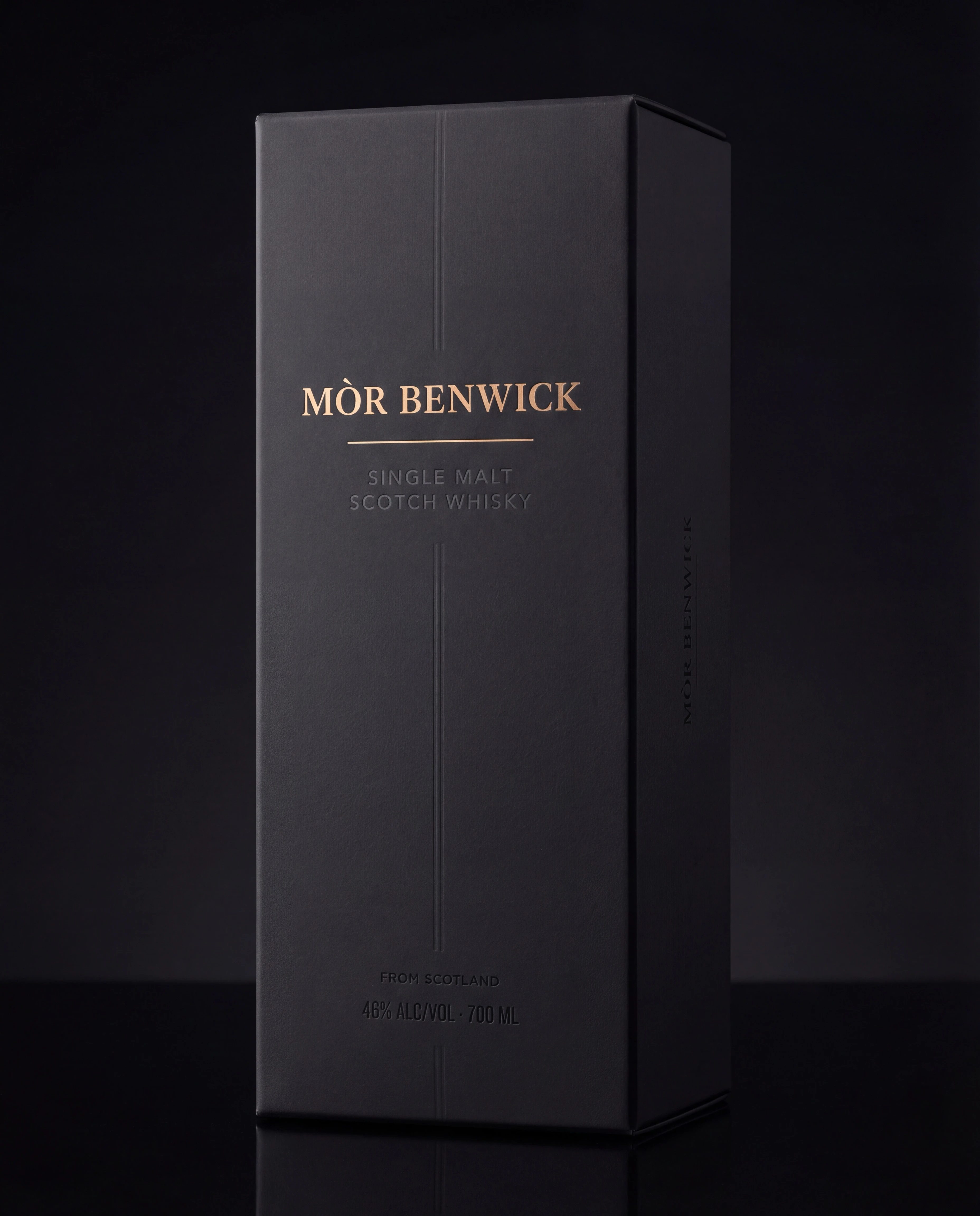
Mòr Benwick is a modern Scotch whisky built around restraint and weight. The aim was to create something that feels old-world and authoritative, without falling into tartan clichés or faux-vintage noise.
A modern classic with quiet authority, built for age and provenance.
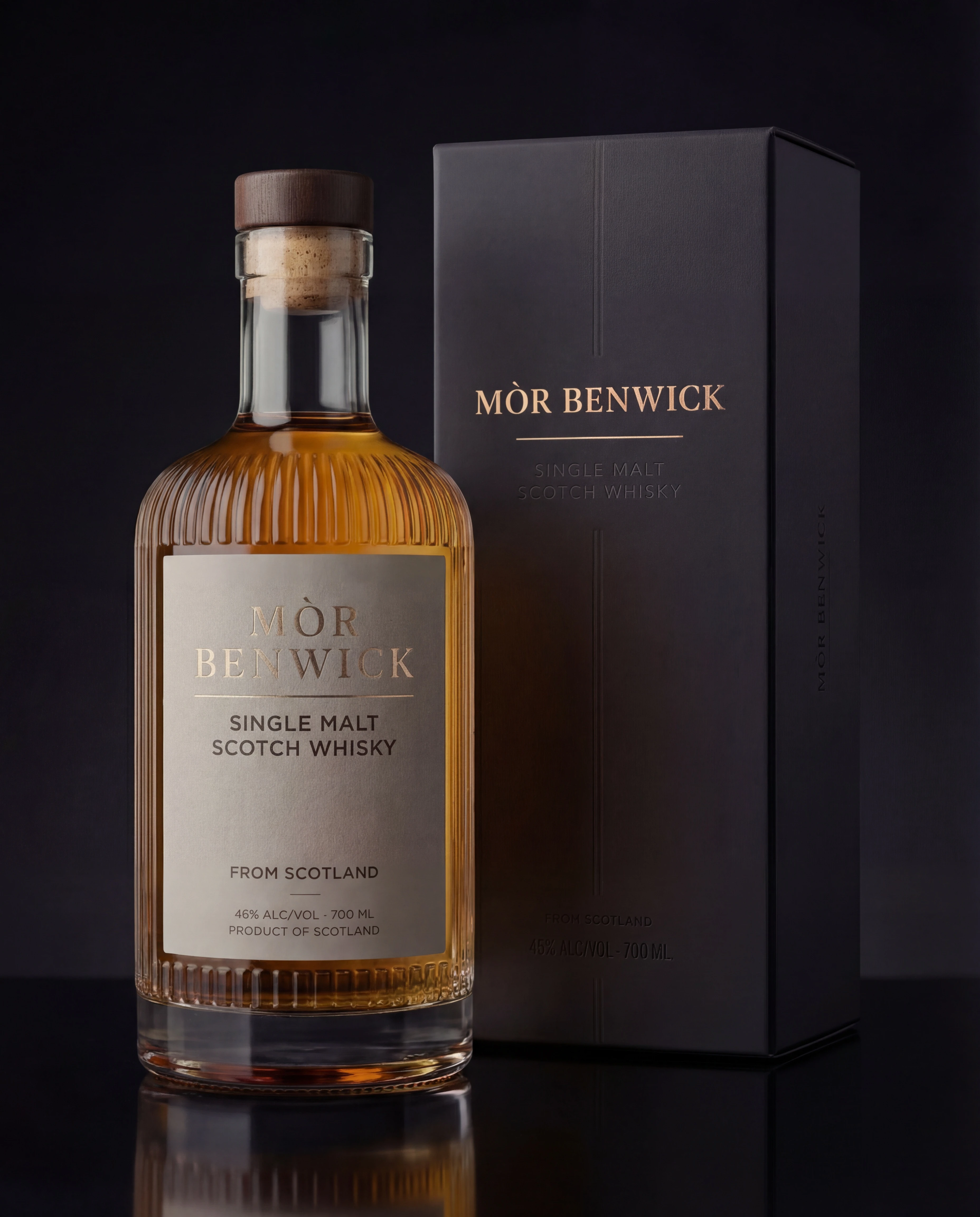
The whisky space is packed with “heritage cosplay.” Mòr Benwick needed to feel premium and established, but still fresh. The label also had to carry a lot of information without looking busy. And the system needed room for future expressions. Age statements, cask types, limited releases.
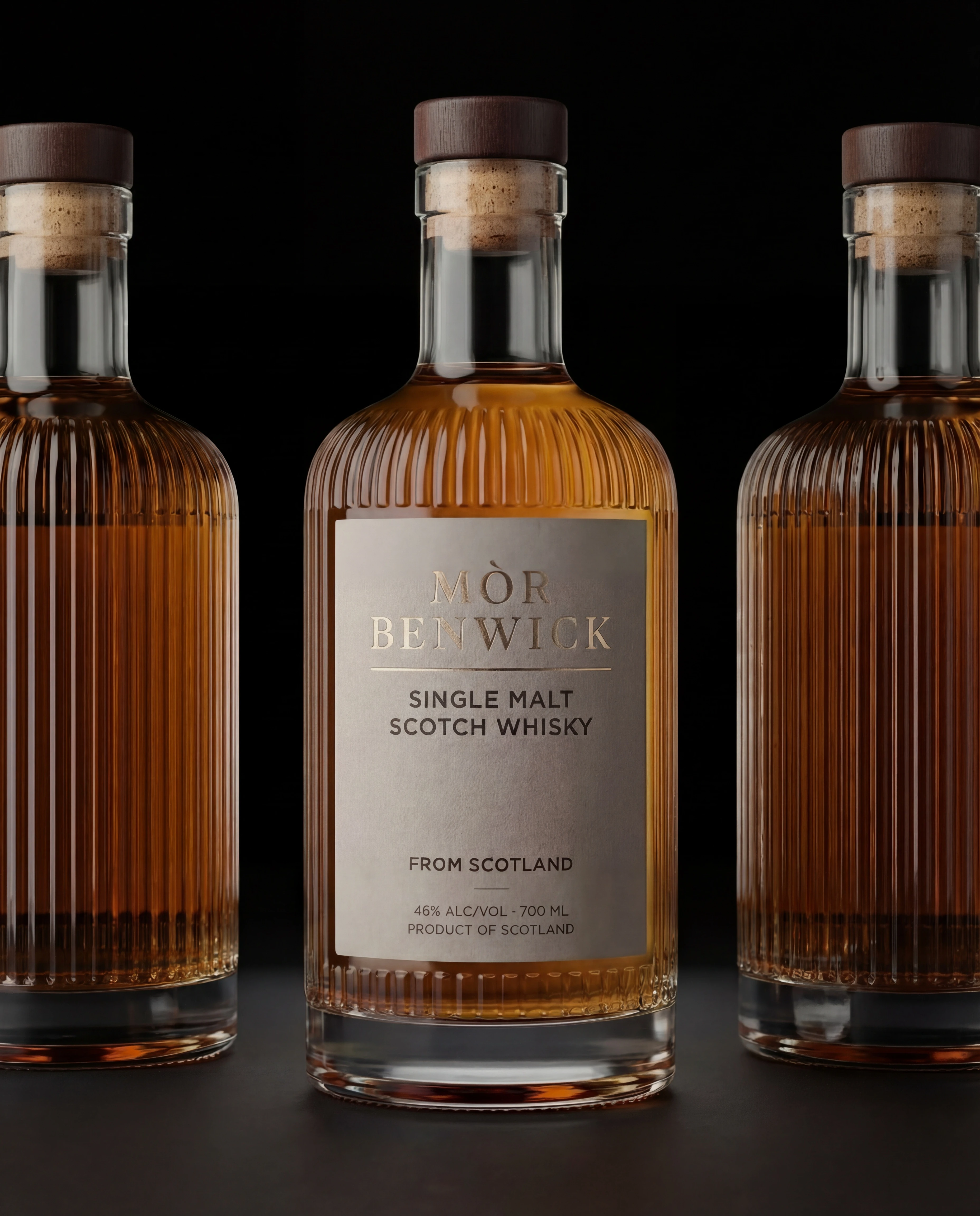
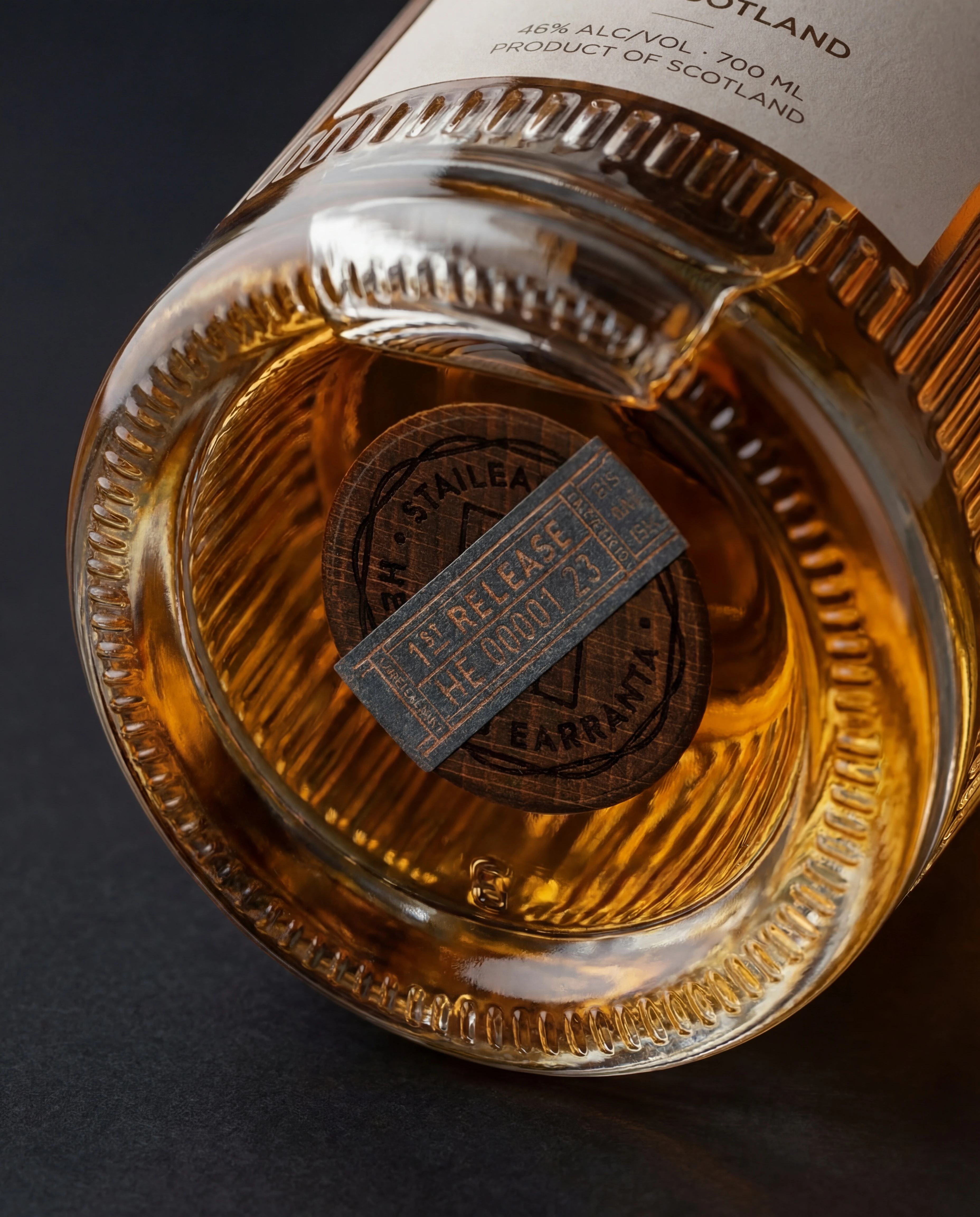
I built a strong typographic hierarchy and used structure as the main design language. Big, confident naming. Clear secondary information. And a detail layer that rewards closer inspection through texture, linework, and finish planning. The result is a label that reads fast at distance, but feels crafted in-hand.

A bottle that signals premium instantly.
A clear read at shelf distance.
Detail that holds up close.
And a scalable system ready for new releases without losing its backbone.
Heritage isn’t a filter. It’s proportion, type, and restraint.
MORE Works

Brasserie Léman
A four-variant label system for a Lausanne brasserie — Blonde, Blanche, Rouge, Noire. Each expression carries its own colour identity while a single structural device holds the range together. French on the front, functional on the back. Rooted in Swiss heritage, built for the shelf.

Brytning
A contemporary aquavit identity built around clarity, contrast, and restraint.
