
Brytning
Brytning Aquavit Packaging Design

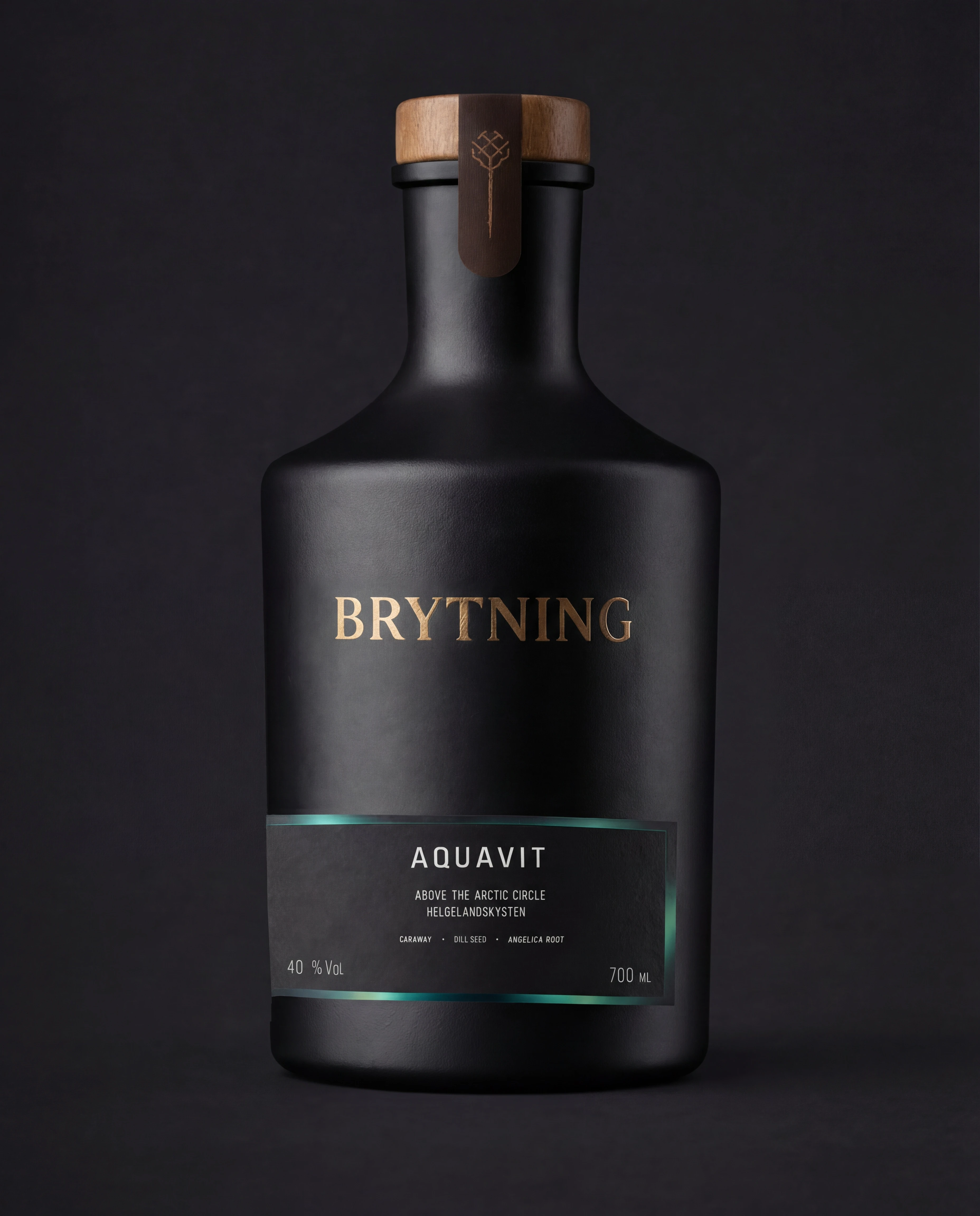

Brytning is an arctic-born aquavit with a calm, modern attitude. The goal was simple. Make a black bottle feel unmistakably premium, with minimal graphics and maximum presence.
Brytning needed to stand out in a crowded category without shouting. The label had to stay small and clean, but still read fast at shelf distance. And up close? It had to feel rich through materials, hierarchy, and finish. Not illustrations.
I built a tight typographic system and let the bottle carry the drama. Gold brand type for instant premium read. A restrained information block for clarity. And a cold edge detail around the label to bring in the “above the arctic circle” story without going literal. Everything was built for print reality. Spacing, contrast, and finishes first.

A bottle that has presence from across the room.
Minimal, but not empty.
Premium cues you can feel in the hand.
And a label system ready for new variants without changing the rules.
Mood is a design choice. So is restraint.
MORE Works

Mòr Benwick
A premium whisky identity rooted in heritage, structure, and long-term presence.

Brasserie Léman
A four-variant label system for a Lausanne brasserie — Blonde, Blanche, Rouge, Noire. Each expression carries its own colour identity while a single structural device holds the range together. French on the front, functional on the back. Rooted in Swiss heritage, built for the shelf.
