
Caerwyn
Caerwyn Gin Packaging Design
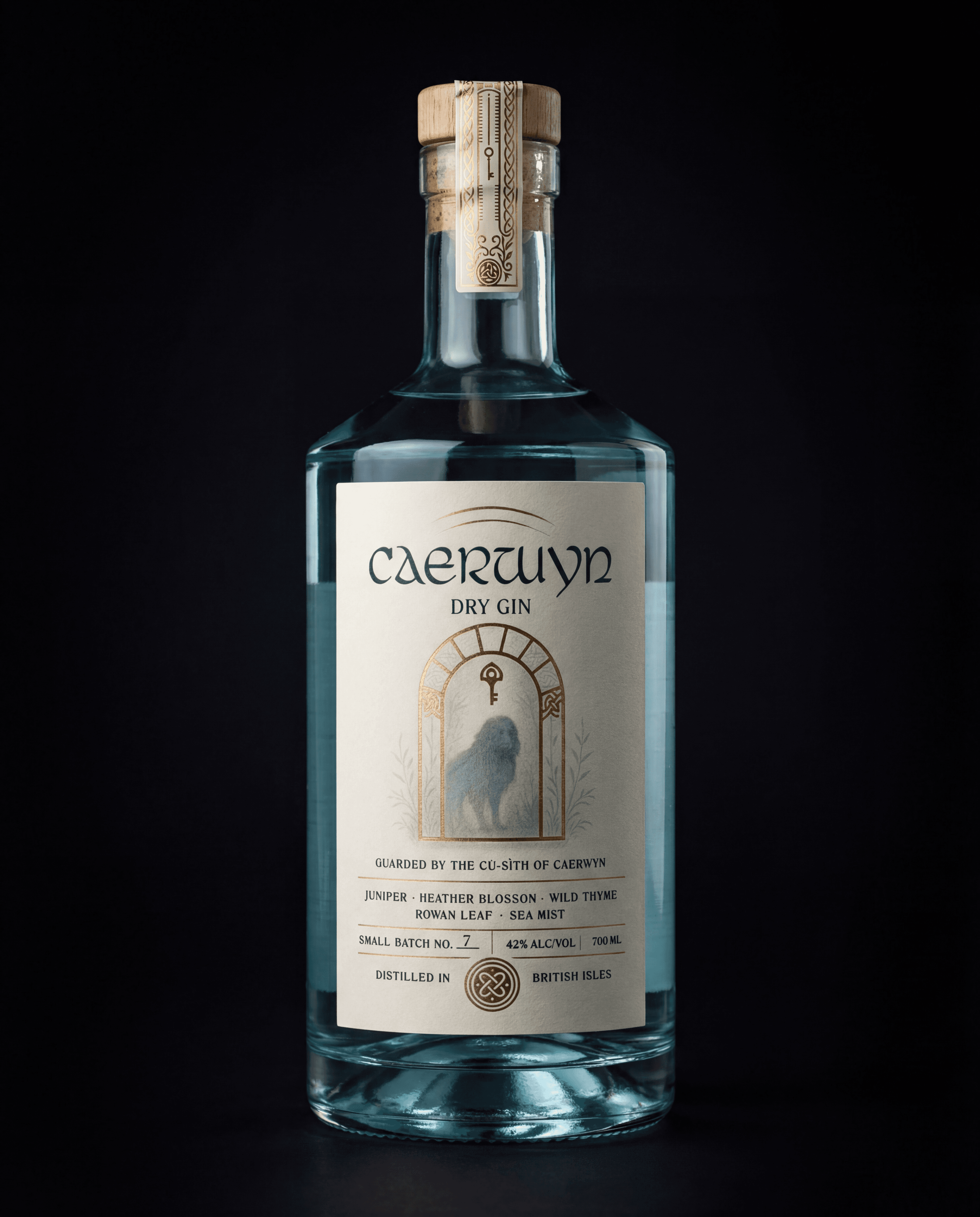


Caerwyn is a dry gin brand built around quiet confidence.
The brief wasn’t to shout louder on shelf,
but to create an identity that would hold up as the brand grew.
The result is a packaging system that balances craft and restraint,
designed to work just as well at launch as it does at scale.
Caerwyn needed to move beyond the feel of a first release
without losing its sense of character.
The challenge was to create a premium presence that felt considered, not ornamental.
Something that could scale across future variants
without becoming rigid or overdesigned.
Clarity, hierarchy, and longevity mattered more than decoration.
The identity was built as a system, not a single label.
Typography, materials, and detailing were carefully restrained,
allowing the brand to feel confident without relying on excess.
Hierarchy was used to guide attention,
while subtle illustrative and material choices added depth up close.
Every element was designed to scale—
from future expressions to wider distribution.t.

Caerwyn launched with a clear, premium presence
that feels established rather than experimental.
The packaging holds its own on shelf
while remaining flexible enough to support future growth.
A brand built to last,
not just to launch.
Craft needs structure.
MORE Works

Mòr Benwick
A premium whisky identity rooted in heritage, structure, and long-term presence.

Brasserie Léman
A four-variant label system for a Lausanne brasserie — Blonde, Blanche, Rouge, Noire. Each expression carries its own colour identity while a single structural device holds the range together. French on the front, functional on the back. Rooted in Swiss heritage, built for the shelf.
